
A minimalistic weather app with a unique knob-based navigation system meant for leisure travellers.
Dialable Weather.
Dialable Weather, designed for leisure travelers, is an app that provides a new take on checking the weather. Instead of using conventional swipe-and-touch interfaces, Dialable Weather utilises a rotatable knob that is used to select settings such as locations and times. This playful interface, combined with a very simplistic layout for the app, makes it suitable for travelers looking to make sure that the places they want to visit are not afflicted with inclement weather to do so quickly, easily, and enjoyably.
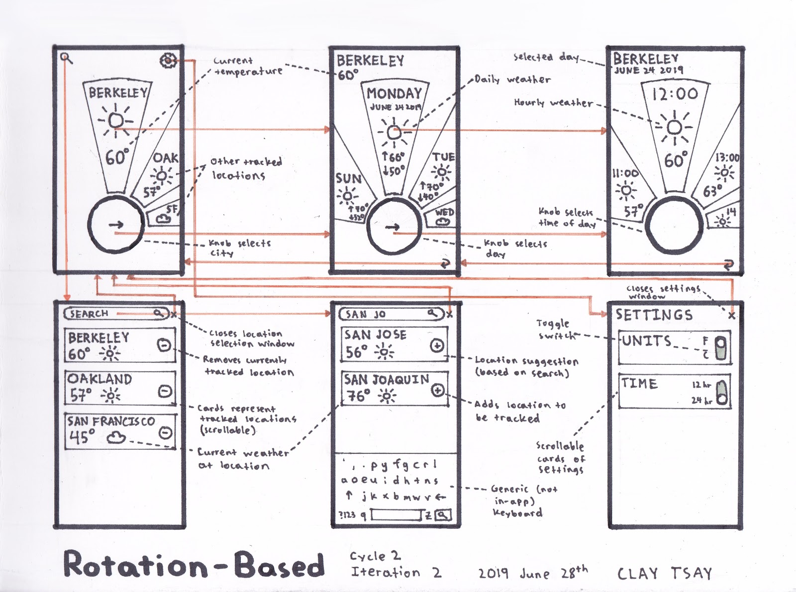
The main interface relies on rotating a knob to select what the user wants, whether that be the location, day, or time of day. Petals surrounding the knob show information, with the central petal being the one selected and showing the most information. Pressing on the knob should take the user to more and more specific details about the weather.
To compare the weathers of different places, there is the starting screen as well as the location selection screen, where users can add and remove different cities that they are tracking in the index screen.
Investigation and Ideation
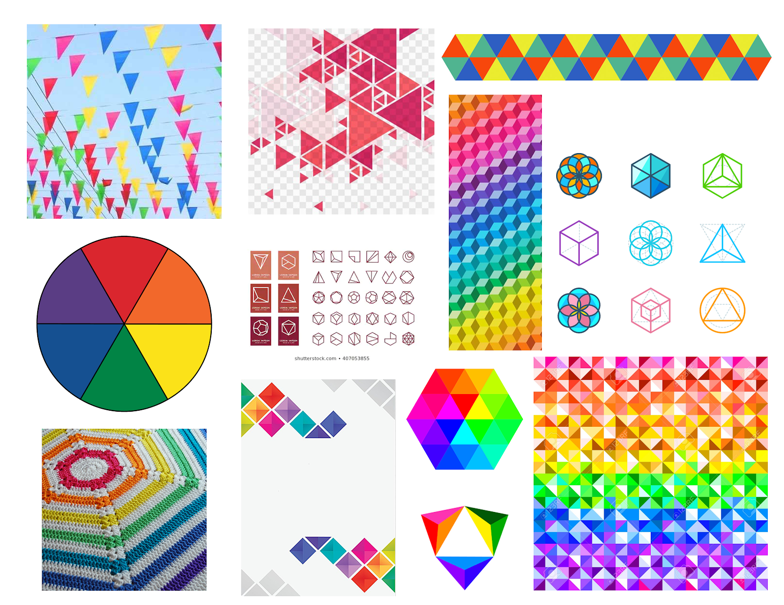
The design task at hand was to develop an app that provides users information regarding the weather. My first task was to construct a mood board to represent the general feel of the app.
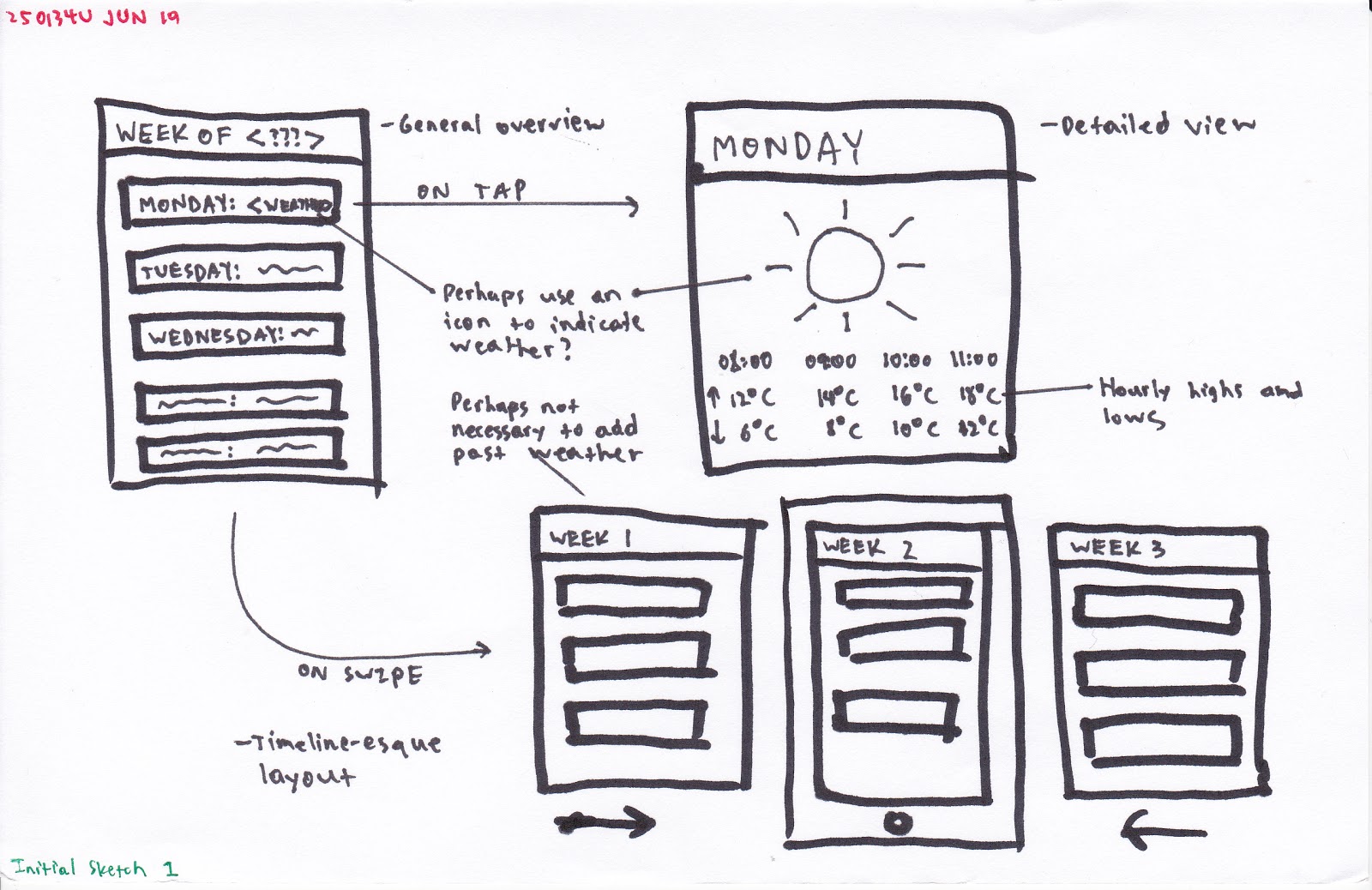
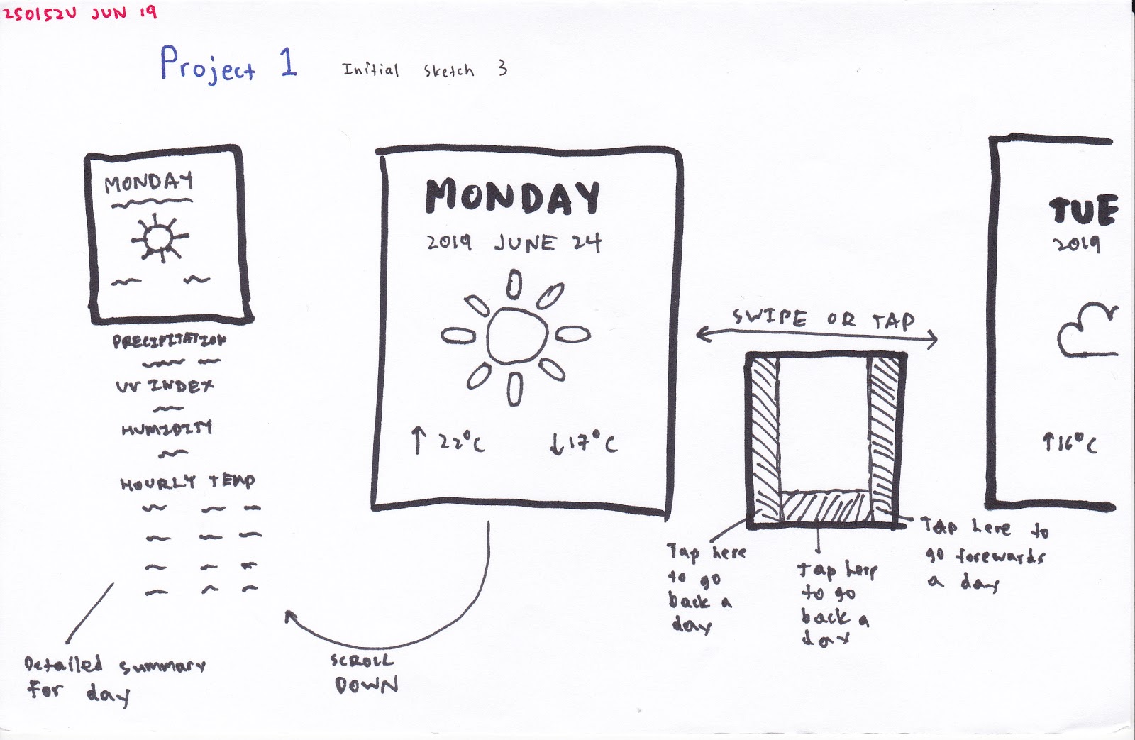
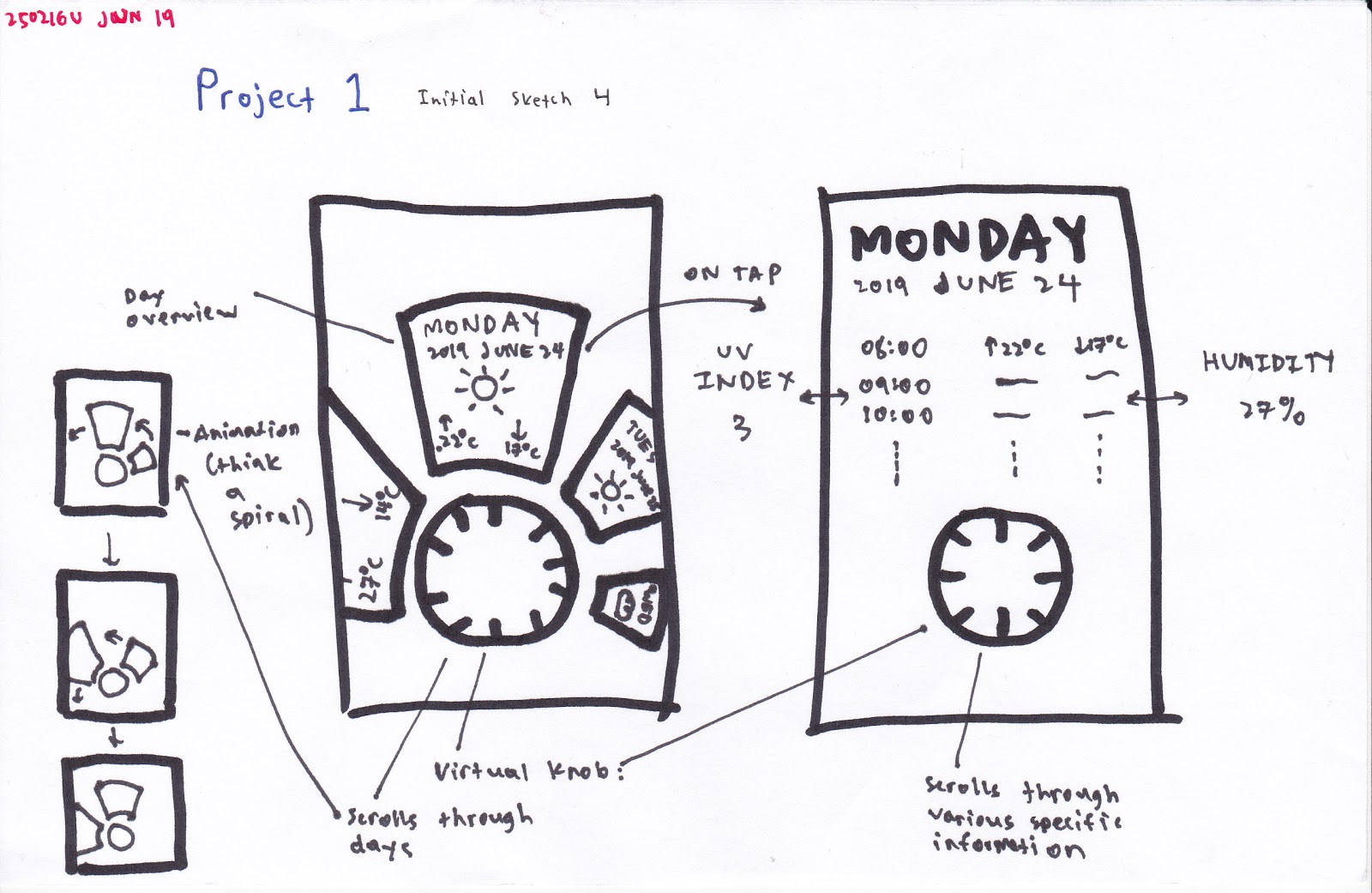
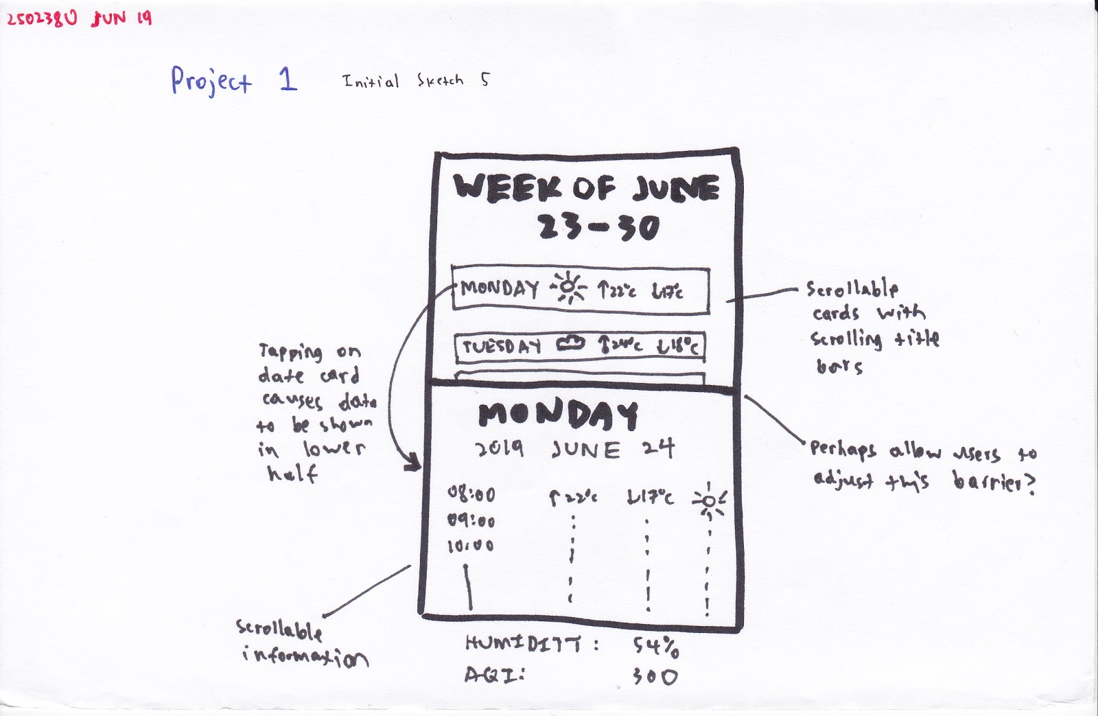
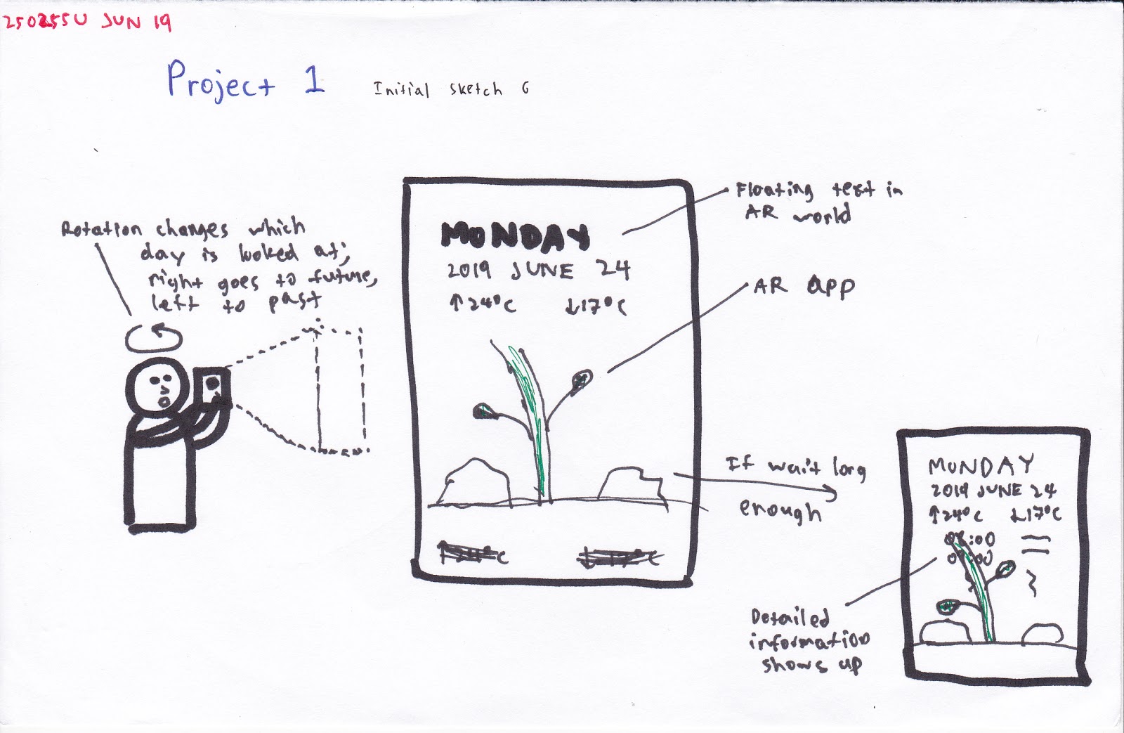
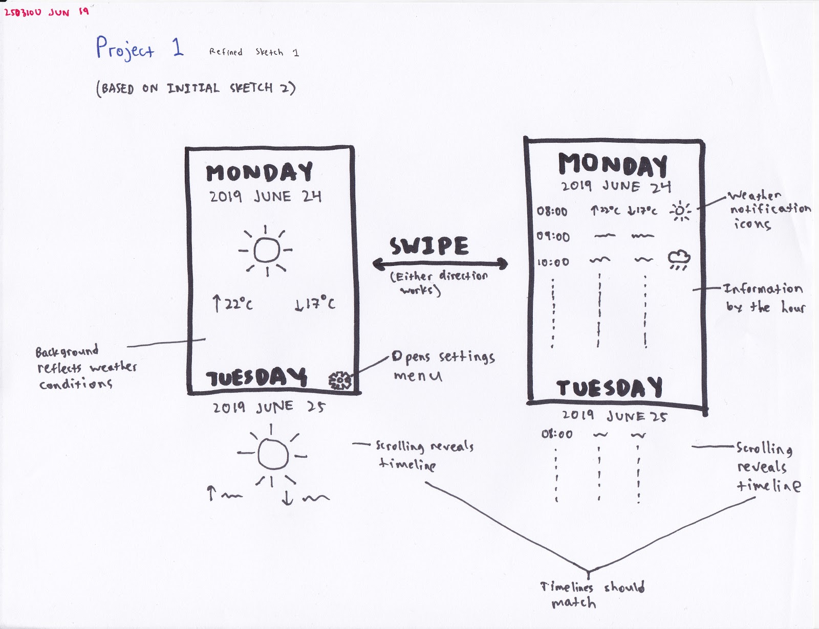
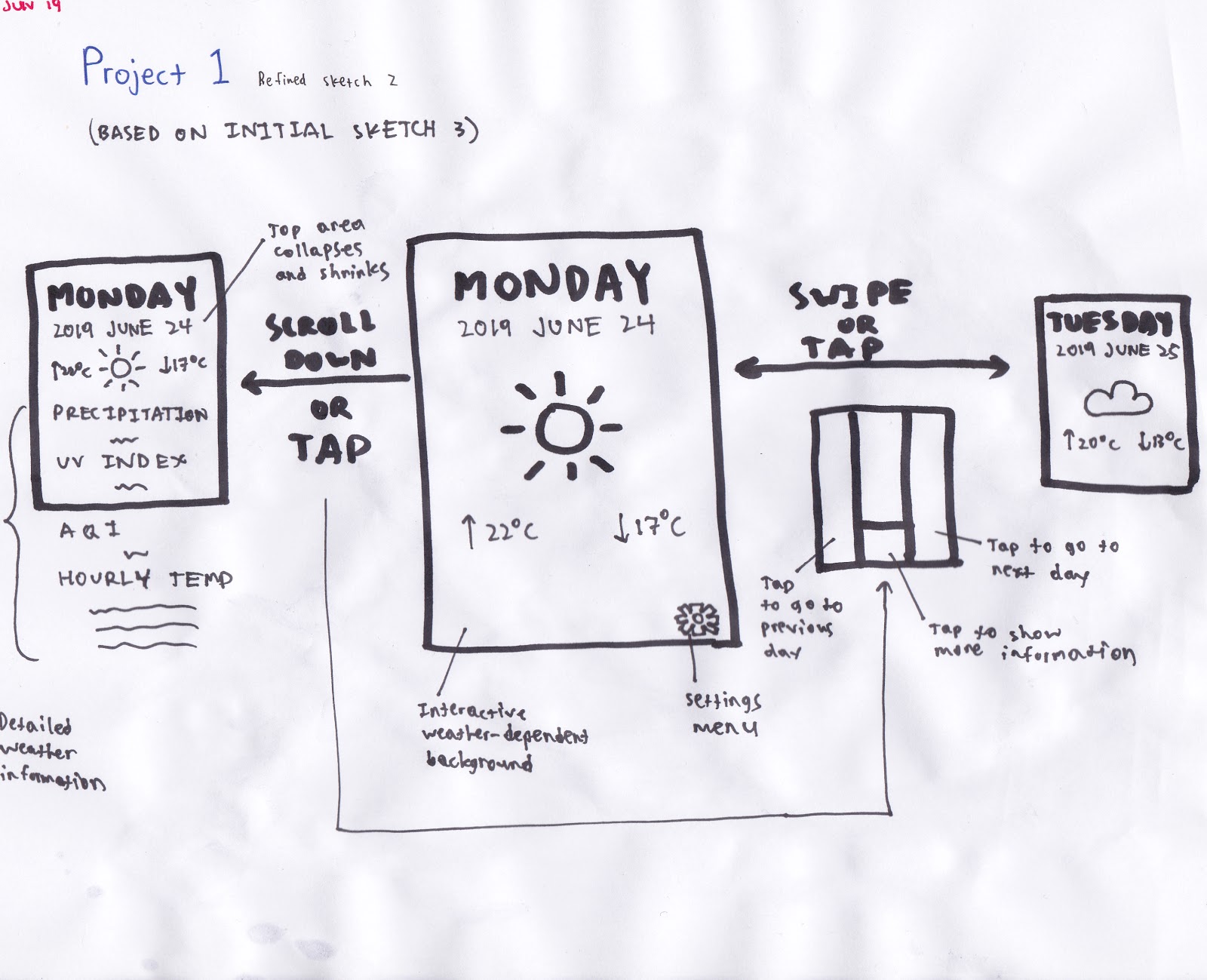
Then began the task of sketching out potential interfaces. I started out with six rough sketches of potential interfaces, each taking no more than a minute to draw.
The moodboard was not directly incorporated into the interaction sketches—doing so would have cluttered the sketches to near non-usability. I anticipated that the backgrounds be composed of various geometric shapes (again, namely triangles) that are coloured according to the predicted weather of the day being viewed. (For example, when looking at the weather information for a day that is expected to be cloudy, the shapes could be light gray coloured.)
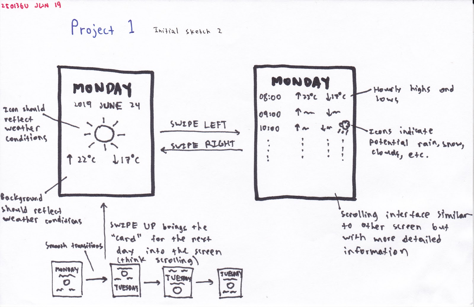
From those six sketches, I picked out three sketches that I particularly liked and expanded on them with a new set of sketches.
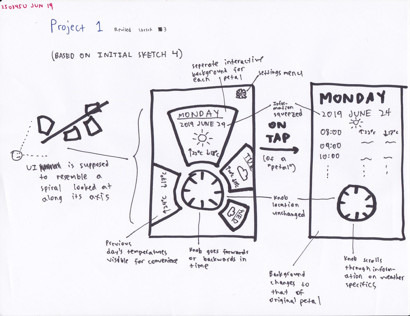
People seemed to like the third “rotation-based” sketch idea and gave a good amount of feedback on it. For example, one evaluator wrote,
I planned on using the next stage of development to further explore the rotation-based UI as a potential candidate, incorporating both the peer feedback received and the mood board. Also, I needed to figure out the UI for selecting location(s).
Low-Fidelity Prototype
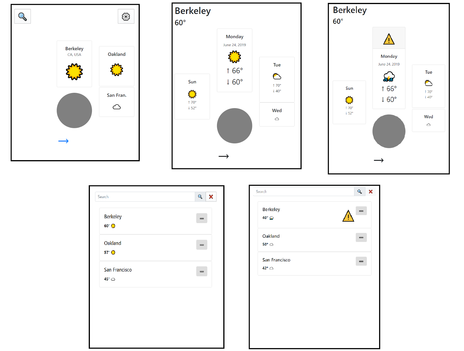
Using the sketches from before, I drew up a rough, pre-studio wireframe of the app.
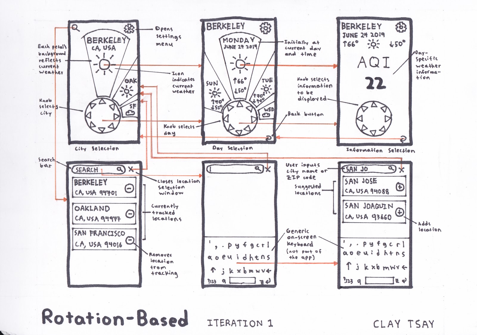
The pre-studio wireframe of the app.
The pre-studio wireframe describes the UI for choosing which locations to track and which to select (when viewing the weather), establishes what buttons lead to what screens, and changes all text to be vertical. The wireframe also uses screens with a more realistic aspect ratio (1440:2560); this made me realize that the petals around the knob had to be far narrower, altering the way I would have to present the information.
I brought this wireframe into the studio for peer critique. Most of the evaluators agreed that the knob and petals concept was unique and should be kept. However, they noted that the UI should display the current temperature, hourly temperatures should be more accessible, and search results should show the weather of the location. In the next wireframe, I planned on preserving the knob structure and replacing the last screen with a knob-and-tape layout with the hourly weather information (perhaps with one tape section dedicated to showing information such as AQI).
Taking that feedback, in my second wireframe, I removed the detailed weather information section (for the sake of simplicity), added an arrow index in the center of the knob, and added a section to represent the settings screen. In adding the arrow index, I decided to remove the triangle designs in the knob in order to reduce cluttering. Additionally, the petals (in the relevant knob-and-petals layouts) and the search cards now show current temperatures and weather conditions, rather than just high and low temperatures.
The revised, post-studio wireframe.
High-Fidelity Prototype
I attempted to duplicate the wireframe exactly but was hindered by my lack of experience in HTML/CSS and Bootstrap. The interface ended up being very rough and barely functional. As a result, though the interactive prototype did end up looking very different from the wireframe, the concepts are essentially identical.
With regards to alignment, this arrangement is clearly poorly aligned vertically. Horizontally, Bootstrap did align the cards into neat columns, but in order to fit the cards to be near to the dial, their alignments were disturbed. The result is very un-aesthetic. Perhaps this would be less of a problem if the cards could be shaped as they were specified in the wireframe as the bottoms of the cards would then be circularly aligned with the knob, making such lack of vertical alignment more “acceptable.”
With regards to the aesthetic-usability effect, I think that this design (when polished to a level further than this) would be quite successful. The rotation-based navigation is more novel to the user and would give them the (perhaps false) impression that the design is aesthetic, making them more likely to use it. The overall design of the app focuses on using the knob UI as much as possible to maximize this effect.
Links and Resources
GitHub: project-1-starter-code-claytsay