
A coloring app that allows users to mix and create colors themselves on a palette before painting. Created in collaboration with Emily Xiao.
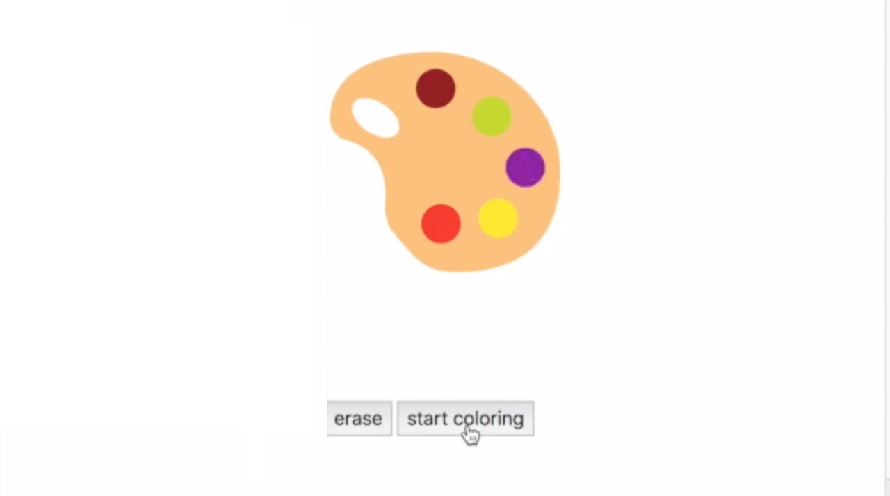
Colour Palette.
This project was aimed at creating a colouring app with a tablet as a form factor. We decided to target leisurely colourers. The key interaction that differentiates this app is the ability to mix colors, much like how artists have to when using oil or watercolour paints. This provides a calming way for users to create their own colors.
Investigation and Ideation
Observational Study
We started out study by performing a task analysis on filling in a coloring sheet.
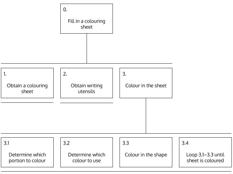
Coloring sheet task analysis tree.
We then proceeded to craft an observational study plan and recruit people to participate in them. We asked questions such as “when was the last time you colored” and “did you have any experience using a tablet to write or draw.” After recording their answers, we observed while they used a coloring app on the tablet. The main observations we made were:
- Having to click on every section to color (for example hair strands) is frustrating if the user needs only one color for these areas.
- The most used tools (eraser, pen) should be at the most accessible locations group together to minimize confusion.
- Buttons that have non-intuitive icons should not cause immediate consequences that can’t be undone (ex. sharing) because the user is likely to press it to see what it does.
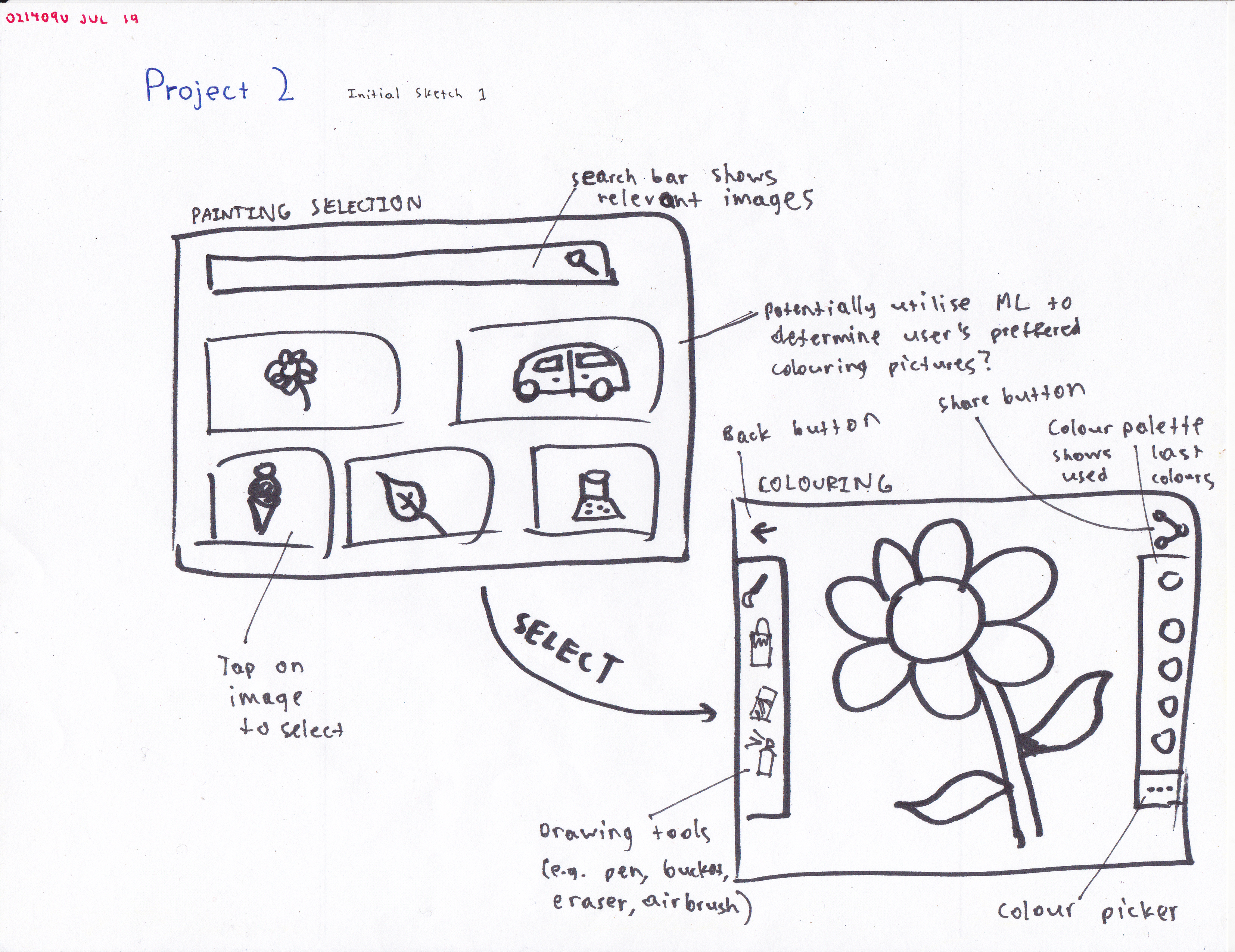
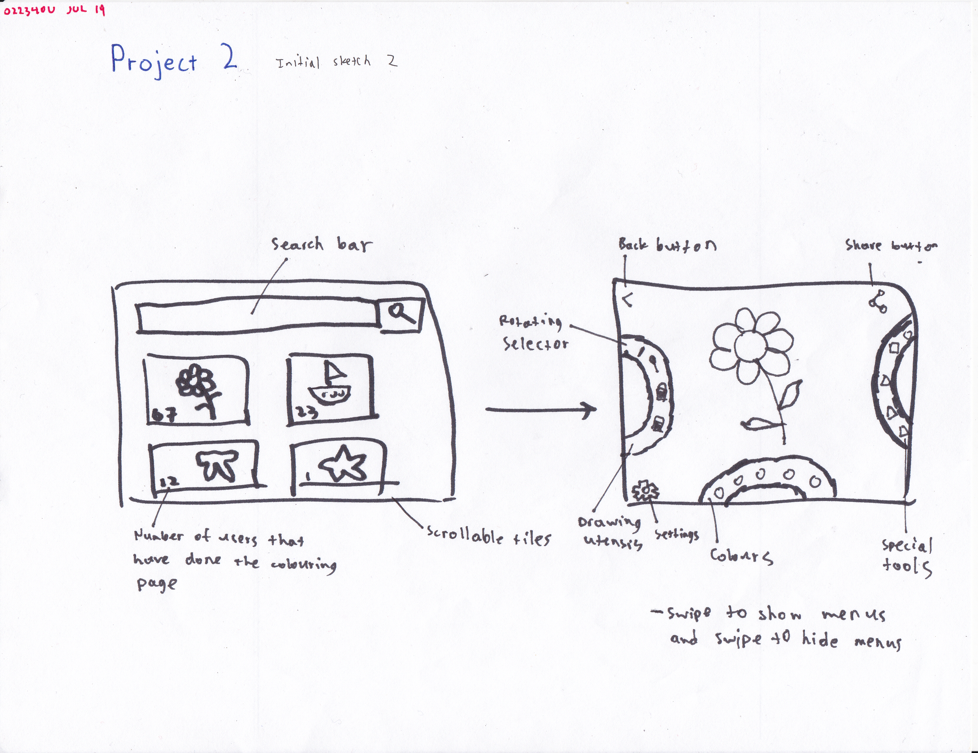
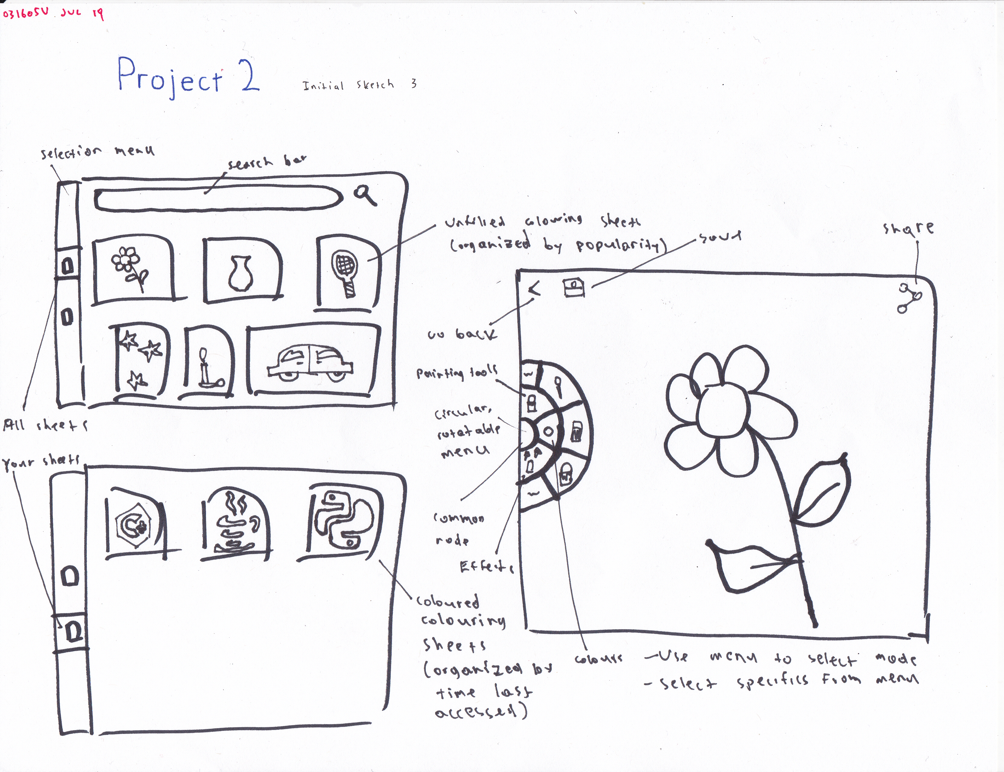
Sketches
With a better idea of our user base, we started sketching out app ideas. These sketches were all motivated by our study. The first sketch is motivated by the user’s hesitation when starting to draw (not knowing what colors to choose, etc). The second is motivated by the user’s inability to find eraser and switch between modes of dotting and swiping. The third is to make user less stressful by making them choose colors beforehand.
Low-Fidelity Prototype
Parallel Paper Prototypes
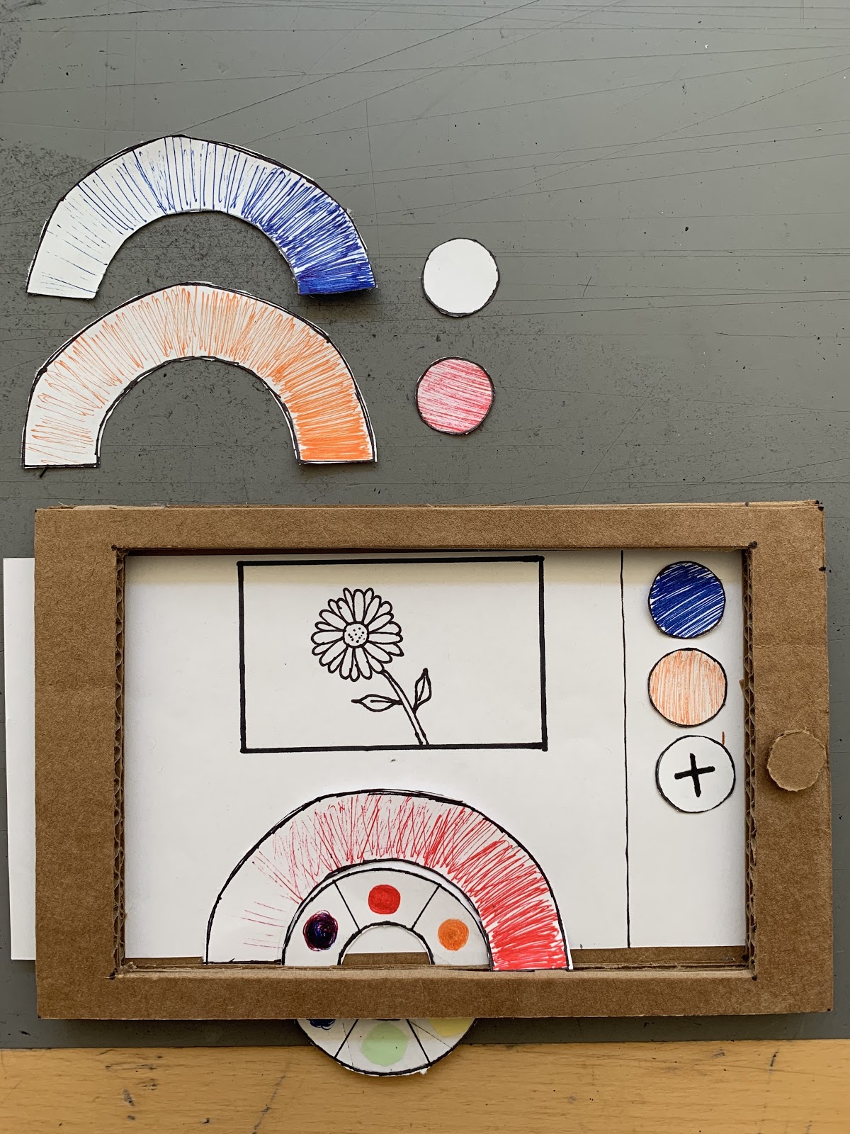
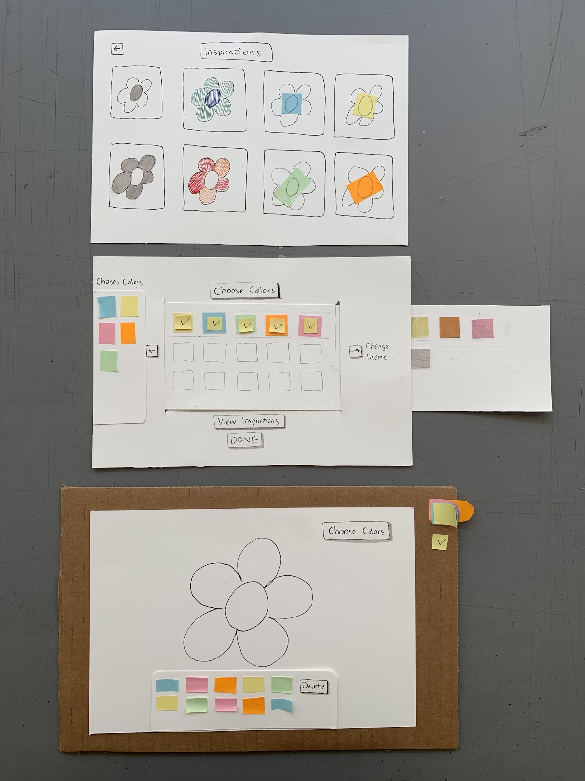
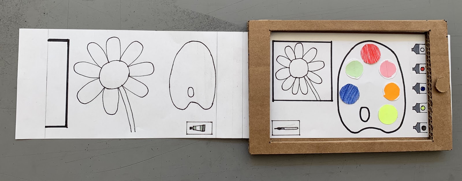
We started off by creating three paper prototypes that were to be tested in parallel. Each was inspired by one of the rough sketches that we made.
The moodboard was not directly incorporated into the interaction sketches—doing so would have cluttered the sketches to near non-usability. I anticipated that the backgrounds be composed of various geometric shapes (again, namely triangles) that are coloured according to the predicted weather of the day being viewed. (For example, when looking at the weather information for a day that is expected to be cloudy, the shapes could be light gray coloured.)
We then conducted a heuristic evaluation using the paper prototypes. One of us would “Wizard of Oz” the prototype for an evaluator while the other recorded observations. We got two people, each of whom used all three of our prototypes.
Users didn’t seem to like the fact that when mixing two colours, one of them would “disappear.” This could be remedied by an undo button or making it so that combining colours would not consume them. Another issue was that users attempted to colour the image directly from the paint tubes, with one suggesting that it would be a good feature to add.
Revised Paper Prototype
After gathering our feedback, we created a revised paper prototype. The major changes from the previous version were:
- Colors can be mixed without “consuming” them.
- Colors can be stored in paint tubes for future use.
- Added undo/redo buttons.
- Increased the “screen” size.
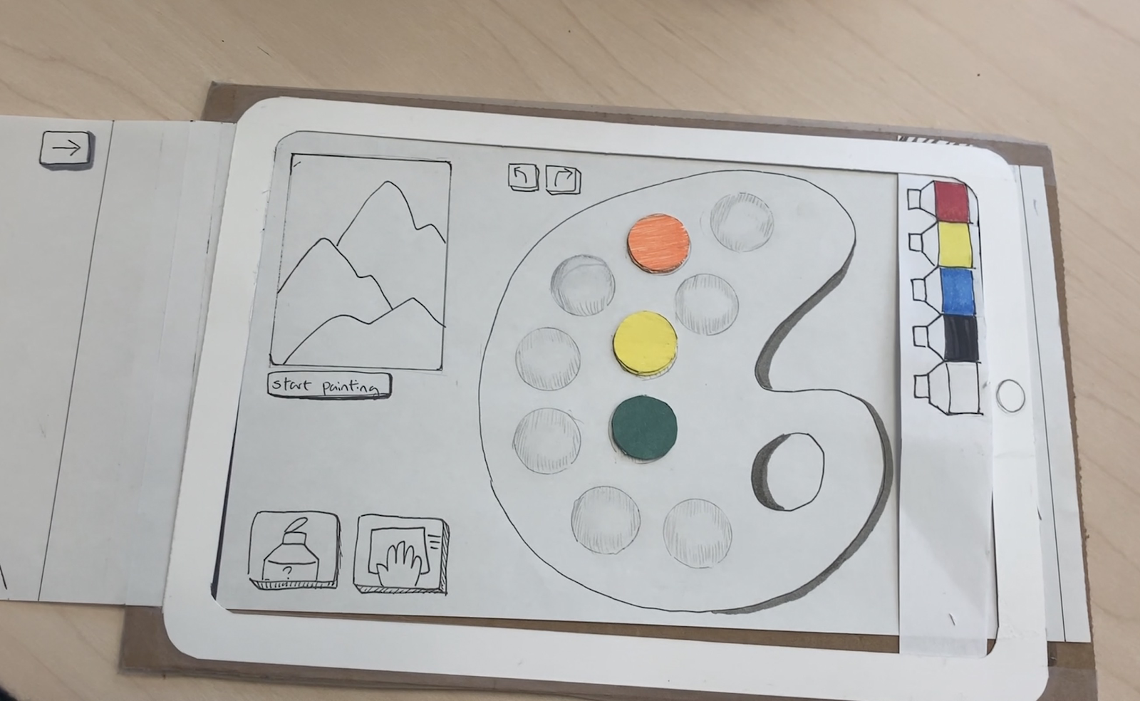
The revised paper prototype.
Implementation Prototypes
Before building our interactive prototype, we set out to build implementation prototypes of features that we wanted to incorporate into our project. In the “Event Handling” prototype, we used jQuery to have the website respond to clicks. In the “Touch Gestures” prototype, we used Hammer.js to identify what type of touch gesture a user was perfoming and respond to it. In the “Paper.js” prototype, we used Paper.js to implement a a basic coloring app.


Interactive Application Prototype
With our paper prototype refined and our implementation prototypes working, we then set out to coding up our interactive prototype. Using Django, jQuery, Paper.js, we created a rough web app version of the interface.
The interactive prototype lacks many features from the revised paper prototype mainly due to time constraints placed on the development of the former. The design and functionality have been simplified immensely—undo/redo and store colour buttons have been omitted and the ability to mix colours within the palette has not been implemented.
To evaluate our interactive prototype, we formulated another usability study procedure and recruited more people to test our app. Our two main questions were:
- Are users able to effectively create the colours that they want?
- Are the mechanics of adding and removing colours easily understandable?
After performing the study, we compiled the information and discovered some interesting points. One of the main issues users disliked was the colour mixing mechanic, which made colours get progressively darker no matter what was done—adding white paint had no effect. This led to some frustration as users simply could not make the colours that they wanted. Another point was that users often attempted to erase multiple colours off of the palette with one click of the eraser, with the conceptual model that clicking on the eraser button would “select” it as a tool: thus, many users attempted to erase multiple colours with one click of the button (which didn’t work).
Links and Resources
GitHub: cs160-summer2019-project2
Implementation prototypes:
- Event handling: p2-events-claytsay
- Touch gestures: p2-touch-claytsay
- Paper.js: p2-paperjs-claytsay