
An app to help students ask questions and teachers answer them during lectures. Created in collaboration with Shahab Amin.
Lequture.
The goal of this project was to create an app where students could pose questions to teachers during lectures. A voting system helps teachers address the most important questions asked.
Investigation and Ideation
For this design project, we were tasked with developing an interface spanning muliple form factors that supports cross-device communication and mobile gesture recognition.
Early on, we decided to try to develop an app that involves students collaborating with teachers in a classrom context. Some ideas we came up with were:
- Have a teacher pose a question to students on a projector. Students send in their work via smartphone and the teacher can choose to select one student’s response to discuss amongst the class.
- Students doing group exams/quizzes submit their answers via electronic device. The program uses a majority vote to decide on the group’s answers to the exam.
- Teachers doing test review utilise a voting system to allow the students to democratically decide which topics to focus on.
- In an interactive review session, digital screens are set up around the room, each with a certain aspect of whatever topic is being reviewed. Groups of students walk around the room and update boards with sub-aspects of the aspects.
- During a lecture or lesson, students add questions to a running list while the teacher presents. Each question is associated with a certain slide in a slide deck. At the end of the presentation, the teacher can address some of the questions.
Interviews, Personas, and Storyboards
To get a handle on what technologies could be useful, we decided to interview middle and high school students and teachers regarding their classroom dynamics. Some of the questions we asked were:
- Describe what kind of middle and/or high school that you have experience in.
- If you had any specific challenges in learning/teaching the curriculum, what were they?
- Describe a time when technology was successfully used to enhance a learning experience. Describe a time when technology was unsuccessfully used.
- What technologies, if any, were employed in your classroom and why? To what extent?
- Do a majority of your peers/your students have access to technology in the classroom?
- Generally, how was/is curriculum delivery structured in your middle/high school?
- Do you have any suggestions on how your classroom experience could have been better?
Ultimately, we were able to interview five individuals:
- A recent high school graduate attending UC Berkeley. Declared valedictorian of her high school class.
- A recent high school graduate that is a female and is a freshman at UC Santa Barbara
- A high school senior (18 years old) that is a male.
- A rising second-year high school student.
- A rising third-year high school student.
From our interviews, we learned that students often don’t participate in class because they find the curriculum or activities to be uninteresting. Their use of poorly-restricted electronic devices give them an avenue to distract themselves from in-class technology-utilising activities that a teacher may want to do. Additionally, it is challenging for teachers to catch and punish wrongdoers.
In addition, existing ways to boost student class participation include giving participation credit or using interactive slides/questions such as Kahoot, Quizlet Live, and Pear Deck. Participation credit adds more concrete incentive to participating in class while Kahoot et al make it more exciting and interactive. With regards to Kahoot-like services, both group and individual activities can be engaging.
From what we learned, we constructed a persona of the type of user that we were going to develop our app for.
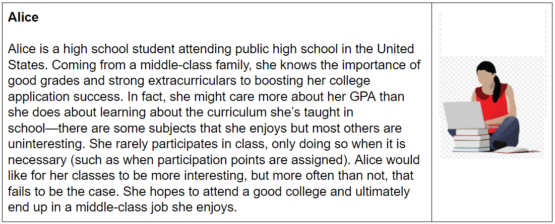
A persona of a high school student; a target user of our program.
In addition, we constructed a storyboard and narrative scenario of a use case for our app idea.
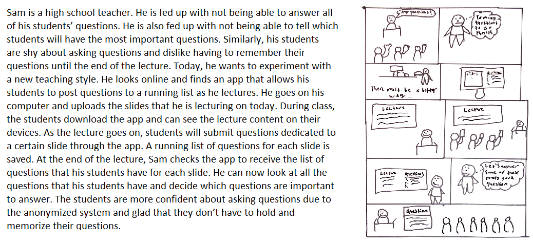
A narrative scenario accompanied by a hand-drawn storyboard.
Implementation Prototypes
As part of the design process, we developed a couple of implementation prototypes that utilized tehnologies central to implementing our app.
WebSocket and Mobile Gestures
In order to synchronize the app across multiple devices, we created some prototypes that used WebSocket technology to communicate between instances.
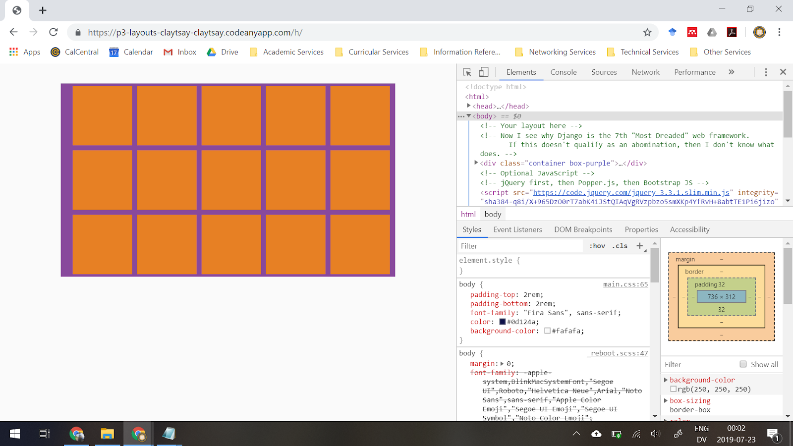
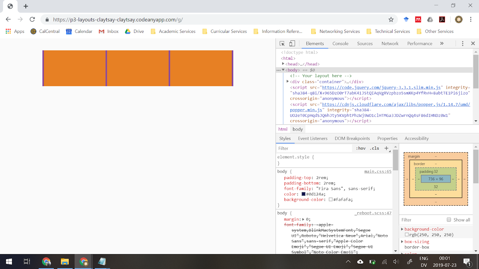
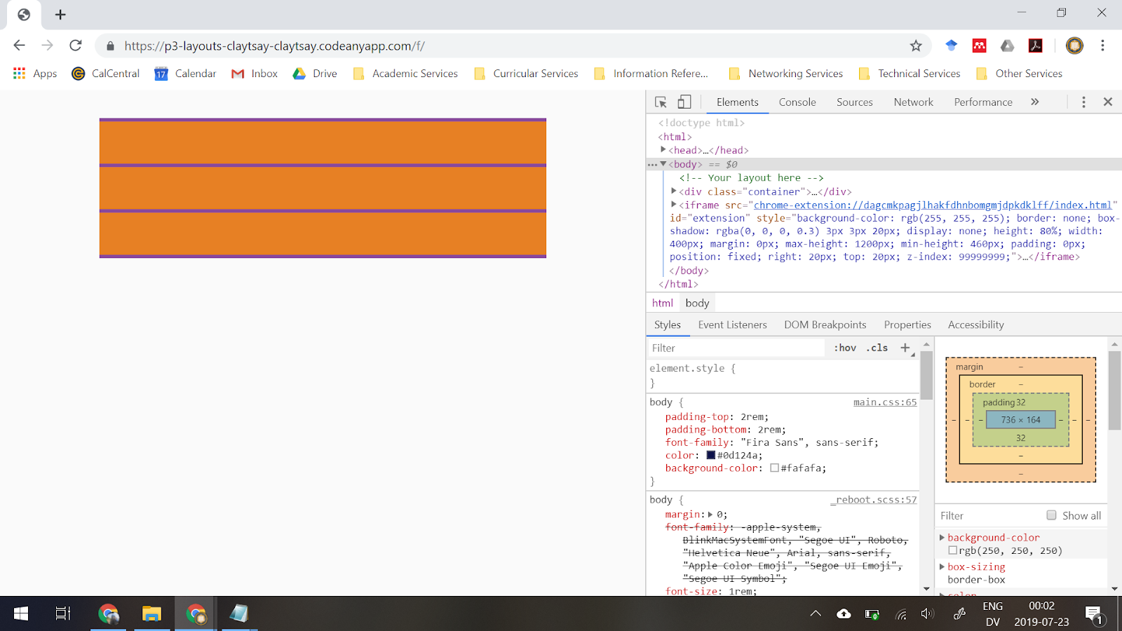
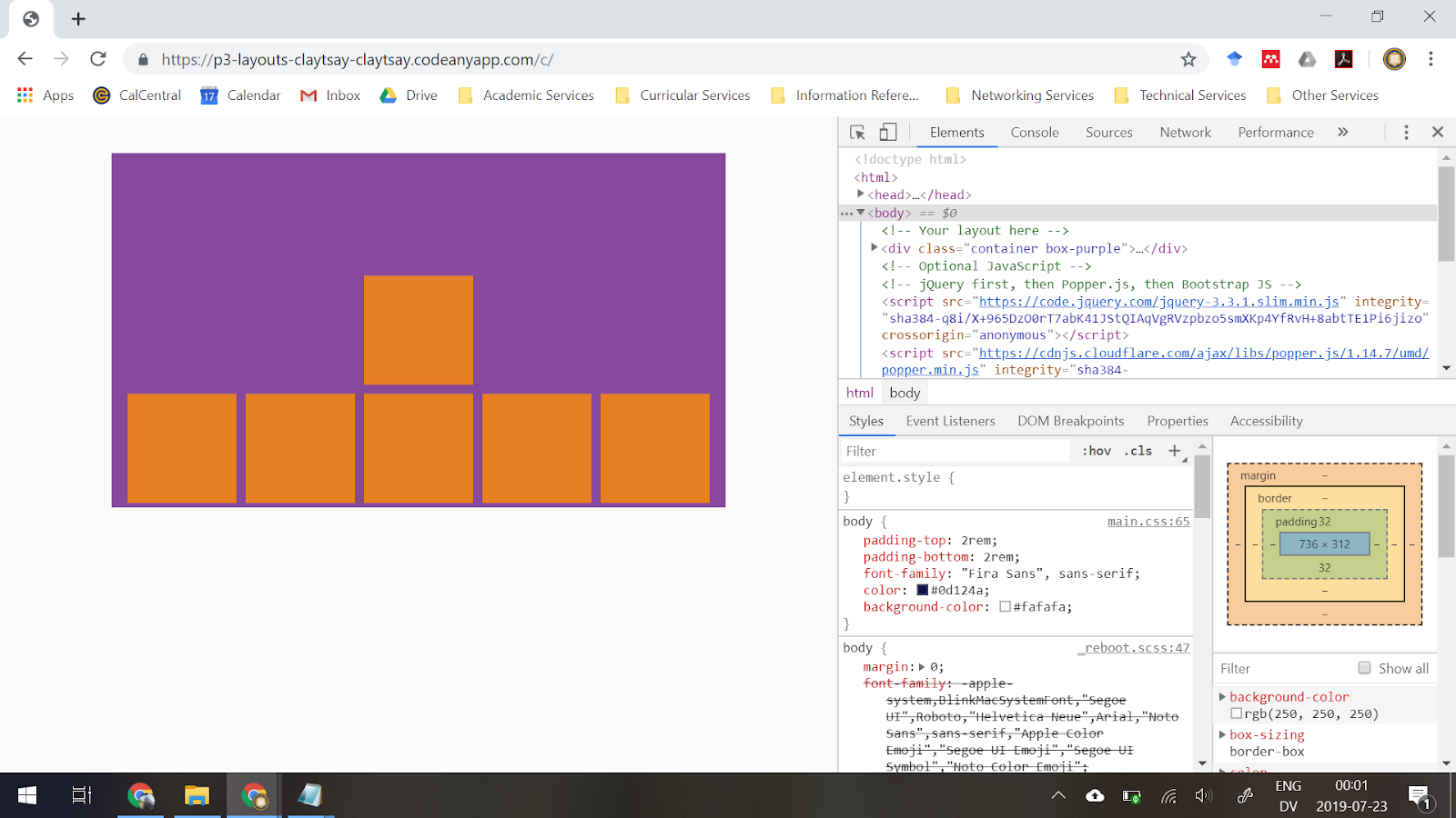
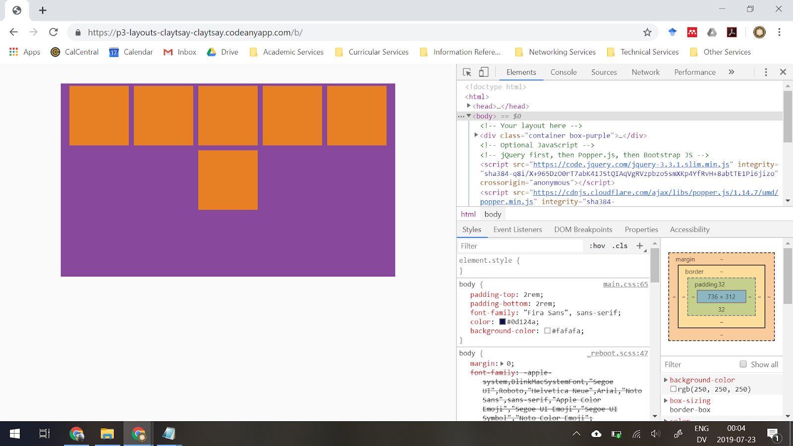
Reactive Layouts
Using Bootstrap’s Flexbox, we created a number of test reactive layouts.
Experiment Design
After we settled on our app being a question asking/answering one, one of the chief concerns we had was that many students would ask closely-related questions, which would nullify the effect of the voting system. To address this, we decided to set up an experiment to see if we could encourage users to vote for questions similar to theirs instead of asking new, closely-related ones.
Our change was to make the query bar in our app less accessible to reduce new question-asking. Our reasoning was that when students come up with questions during a lecture, they don’t want to have to avert their attention from the lecture to see if any of their peers had already asked such a question. Rather than spending that time looking at their peers’ questions, they may just decline to ask a question.
After creating a written experimental procedure, we had a number of students test each version of the UI. The table below identifies the number of questions asked. Version 0 had the search bar on the top while Version 1 had it on the bottom. The last test was incorrectly administered (the user used both interfaces) and so the data may look strange due to this.
| Version 0 | Version 1 | ||||
|---|---|---|---|---|---|
| Asked | Upvoted | Total | Asked | Upvoted | Total |
| 2 | 3 | 5 | 0 | 0 | 0 |
| 1 | 2 | 3 | ? | 1 | ? |
| 1 | ? | ? | |||
Unfortunately, due to a shortage of data (only one subject’s result for Version 1), a t-test could not be completed—an undefined variance would be produced. Nevertheless, from looking at the mean number of questions asked for each treatment group, it can be guessed that Version 0 encouraged students to ask more questions. This agrees with the posited hypothesis.
However, the way that the study was conducted introduced numerous confounding variables. Due to technical limitations, subjects had to use a laptop to use the mobile app, switching between tabs to see the student and instructor views of the app, which could have discouraged them from asking questions overall or made it far more difficult to scroll down. Based on what insufficient data we had, Version 0 appears to be more promising.
Usability Study
In addition to our experiments, we wrote out a procedure to test the usability of our app. In total, two participants were observed while using our app: a female who is a recent college graduate and a male rising senior at UC Berkeley.
All of the participants in the study said that the textbox to submit questions should be bigger. People were able to see it, although it seems to have been to small and therefore kind of hidden, or unable to be found at all as in version 1. In additioin, in version 1, none of the participants were able to find the textbox to submit questions. This shows that orientation and positioning on the page are extremely important for a fluid user interface and a positive user experience. This was not an issue in version 0, although the overall positioning for both versions seems to need revising.
The biggest piece of valuable feedback that we received is the positioning of the elements. In version 0, both participants were able to navigate the textbox to submit questions and the list of already submitted questions. Although in version 1, neither participant was able to find the textbox to submit questions. While it’s clear that version 0 is easier to use, version 0 still needs a redesign. Having the textbox to submit questions above the list of already submitted questions created an accessibility issue. If the elements were side by side, perhaps space on the page could have been used more efficiently. In a future iteration, we would experiment with positioning the elements side by side and making the textbox to submit questions larger and easier to see. Also, we would experiment with adding a scrollbar on the list of already submitted questions so that it doesn’t span so far down the page.
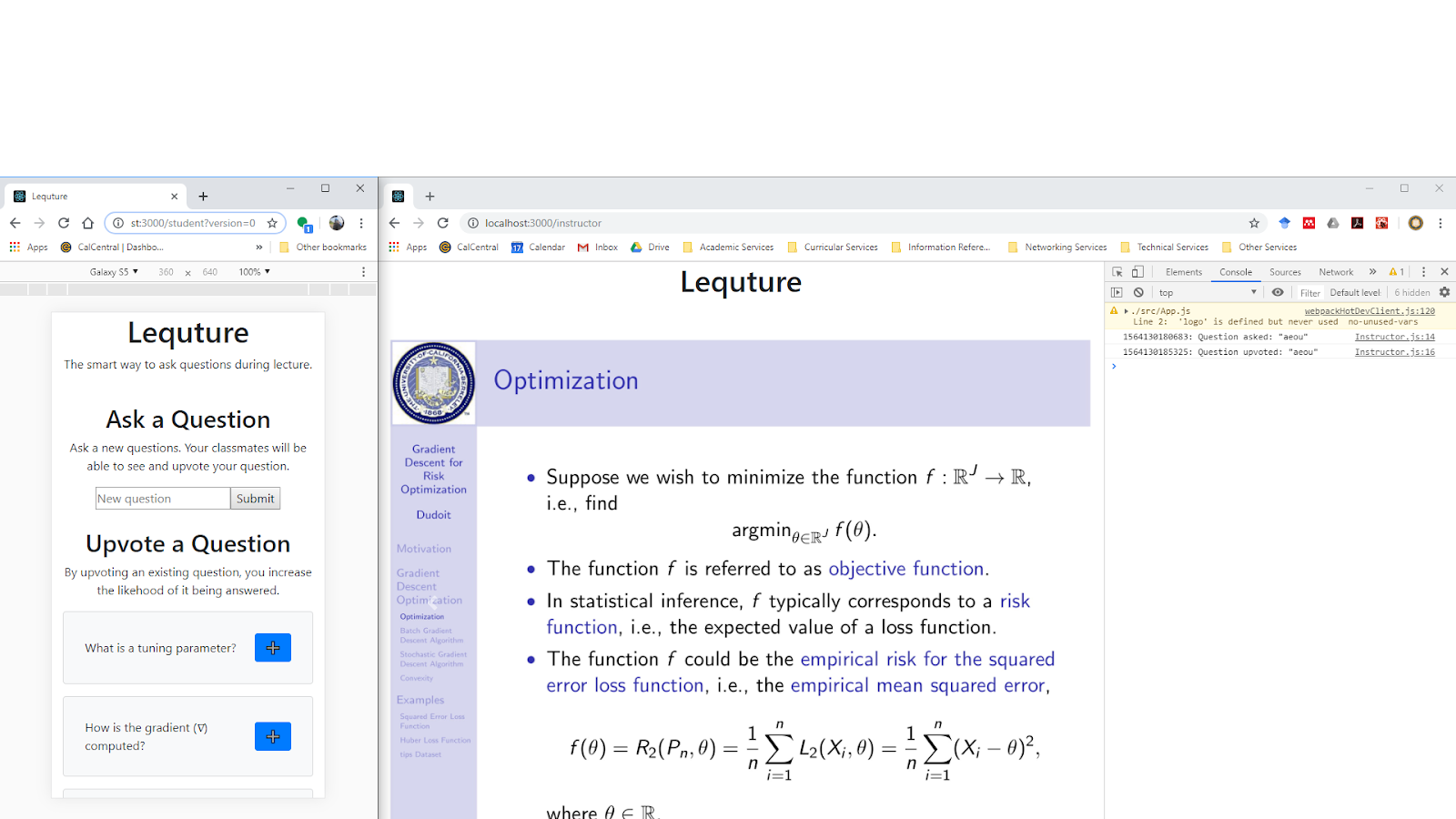
Final Prototype
Due to time constraints, the final prototype was still quite rough. The core functionality (i.e. asking/receiving questions) as well as a student-side interface were implemented.
Links and Resources
GitHub: cs160-summer2019-project3
Implementation prototypes:
- WebSocket and mobile gestures: p3-websockets-claytsay
- Reactive layouts: p3-layouts-claytsay